
Excel 2010 -
Creating PivotTables

Excel 2010
Creating PivotTables

search
menu
/en/excel2010/using-conditional-formatting/content/
PivotTable reports—or PivotTables—make the data in your worksheets much more manageable by summarizing the data and allowing you to manipulate it in different ways. PivotTables can be an indispensable tool when used with large and complex spreadsheets, but they can be used with smaller spreadsheets as well.
In this lesson, you will learn the basics of creating and manipulating PivotTables.
When you have a lot of data, it can sometimes be difficult to analyze it all. A PivotTable summarizes the data, making it easier to manage. Best of all, you can quickly and easily change the PivotTable to see the data in a different way, making it an extremely powerful tool.
Optional: You can download this example for extra practice.
The example below contains sales statistics for a fictional company. There is a row for each order, and it includes the order amount, name of the salesperson who made the sale, month, sales region, and customer account number.
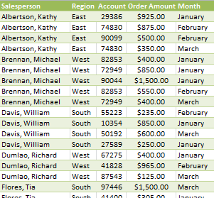 Company Sales Statistics
Let's say we wanted to answer the question What is the amount sold by each salesperson? This could be time consuming because each salesperson appears on multiple rows, and we would need to add all of the order amounts for each salesperson. Of course, we could use the Subtotal feature to add them, but we would still have a lot of data to sift through.
Luckily, a PivotTable can instantly do all of the math for us and summarize the data in a way that's not only easy to read but also easy to manipulate. When we're done, the PivotTable will look something like this:
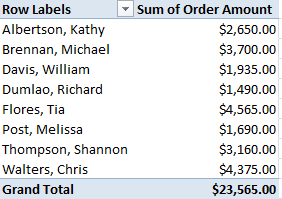 A finished PivotTable
As you can see, the PivotTable is much easier to read. It only takes a few steps to create one, and once you create it you'll be able to take advantage of its powerful features.
 The PivotTable command
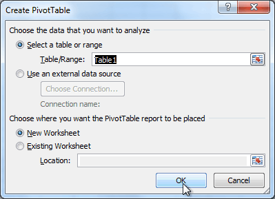 The Create PivotTable dialog box
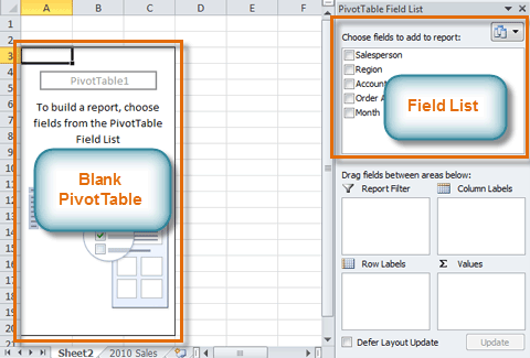 The Blank PivotTable and Field List
You'll need to decide which fields to add to the PivotTable. Each field is a column header from the source data. It may be helpful to recall the question you are trying to answer. In this example, we want to know the total amount sold by each salesperson, so we'll need the Order Amount and Salesperson fields.
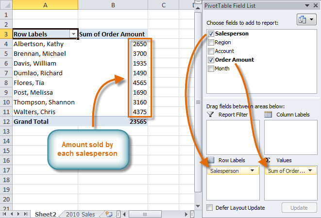 Adding fields to the PivotTable
Just like with normal spreadsheet data, you can sort the data in a PivotTable using the Sort & Filter command on the Home tab. You can also apply any type of formatting you want. For example, you may want to change the number format to Currency. However, be aware that some types of formatting may disappear when you modify the PivotTable.
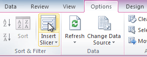
If you change any of the data in your source worksheet, the PivotTable will not update automatically. To manually update it, select the PivotTable and then go to Options Refresh.
One of the best things about a PivotTable is that it lets you pivot the data in order to look at it in a different way. This allows you to answer multiple questions and even experiment with the data to learn new things about it.
In our example, we used the PivotTable to answer the question What is the total amount sold by each salesperson? Now we'd like to answer a new question, What is the total amount sold in each month? We can do this by changing the row labels.
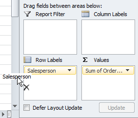 Dragging a field out of Row Labels
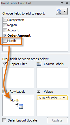 Dragging a new field into Row Labels
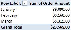 The updated PivotTable
So far, our PivotTable has only shown one column of data at a time. To show multiple columns, we'll need to add column labels.
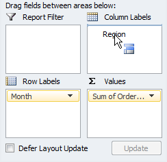 Adding a field to Column Labels
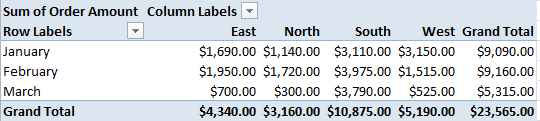 The updated PivotTable
Sometimes you may want focus on a portion of the data and filter out everything else. In our example, we'll focus on certain salespeople to see how they affect the total sales.
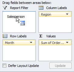 Adding a Report Filter
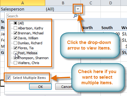 Using a Report Filter
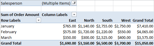 The updated PivotTable
Slicers were introduced in Excel 2010 to make filtering data easier and more interactive. They're basically just report filters, but they're more interactive and faster to use because they let you quickly select items and instantly see the result. If you filter your PivotTables a lot, you might want to use slicers instead of report filters.
 The Insert Slicer command
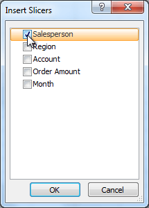 Selecting a field
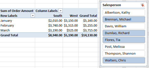 A slicer with four selected items
Just like with report filters, only the selected items are used in the PivotTable. When you select or deselect items, the PivotTable will instantly reflect the changes. Try selecting different items to see how they affect the PivotTable.
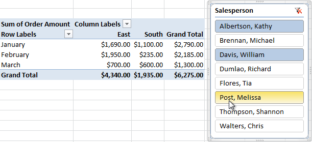 Ctrl-clicking to select multiple items
A PivotChart is like a regular chart, except it displays data from a PivotTable. As with a regular chart, you'll be able to select a chart type, layout, and style to best represent the data. In this example, we'll use a PivotChart so we can visualize the trends in each sales region.
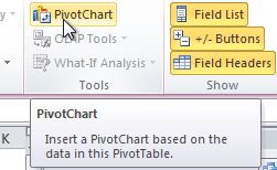 The PivotChart command
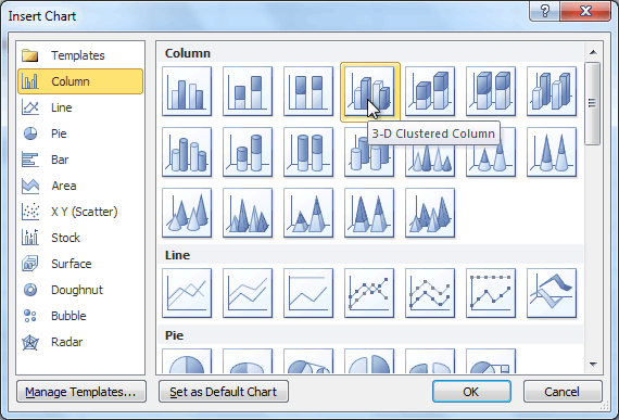 Selecting a chart type
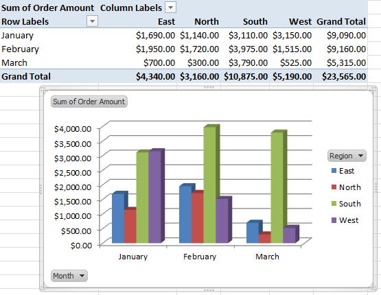 A PivotChart
If you make any changes to the PivotTable, the PivotChart will adjust automatically.
/en/excel2010/using-whatif-analysis/content/