
Excel Tips -
Using the Quick Analysis Tool

Excel Tips
Using the Quick Analysis Tool

search
menu
/en/excel-tips/why-you-should-avoid-merging-cells/content/
There are a lot of ways to visualize data in Excel, but sometimes it's hard to know where to start. Luckily, the Quick Analysis tool lets you browse through many different options even if you don't know exactly what you want.
This tool is only available in Excel 2013 or later versions.
Whenever you select a cell range, the Quick Analysis button will appear in the lower-right corner of the selection.
To see how these options are tailored to your specific data, watch the video below.
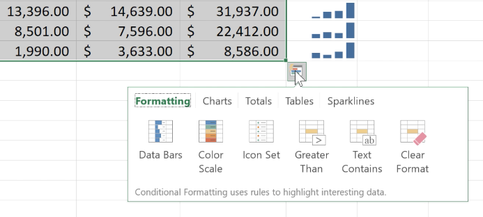
You can dive right in to see what the Quick Analysis tool can tell you about your data. Experiment with different chart styles, colors, and formatting options to further customize your visualizations.
Continue on to the next lesson to learn how to make charts auto update.
/en/excel-tips/how-to-make-charts-auto-update/content/